WAVE accessibility check

Wave Accessibility Reflection
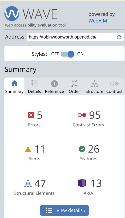
When I ran the WAVE accessibility report on my blog I was not so surprised to see so many contrast errors because, while I have explored changing my blogs appearances, I have not done much changing of the color palette or bolding. Moving forward I am going to adjust my blog’s appearance to fix the contrast and bolding to make it easier to read. I also noticed missing alternative text errors, like on my movie photo collage, which I think could be beneficial in giving deeper insight into any creations I include in my blog.
Trying a text to speech tool!

Text-to-speech Tool Reflection
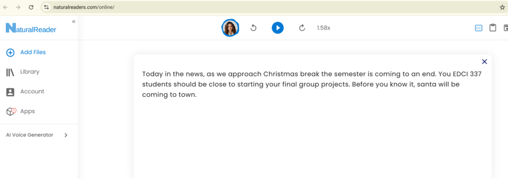
The only text to speech tool I have used before is google translate when I get it to say the translated word out loud so I can hear the pronunciation. In my exploration with NaturalReader I found that there are many ways you can approach text to speech. My version of exploration consisted of trying to find the best voice for a news report. Many of the voices were too bland or sounded slightly robotic, but a few options worked great. A big thing I found was that the talking speed was slightly slow, which made it hard to engage with. Luckily, the speed adjustment function allowed me to speed it up and it sounded a lot better. When I think of the ability to absorb information, I believe the speed that one is talking matters strongly and will differ across what is trying to be said. By this I mean there are cases when slower talking would be beneficial, like when introducing a fully new concept or speaking to a child. Another big thing this makes me think of is cross cultural differences in pragmatics and dialect. When it comes to having meaning in your speech and getting a point across, there is different emphasis on certain words or phrases across the world. Also, when it comes to speed, for example, Spanish speaking countries differ, and what is the normal talking speed for one person could be different for the next. When I think of inclusive design, if a blind person were to hear something produced by these tools, how accurate will their interpretation be if what they hear follows different pragmatics then their own? What I am getting at is that text to speech tools are good tools, but have a long way to go as pragmatics and cross-cultural differences in language are very complex.

Infographic from scratch ^

Infographic starting with template ^
Infographic Reflection
I created two infographics, one from scratch, and one with a template. When creating my infographic from scratch, I really focused on color, contrast, and alignment. I wanted to use colors that relate to nature and gardening, like green and brown, and through the use of the evenly aligned circles, I used contrast with emphasis on the title of the overall stage of the yard transformation. When I finished my infographic from scratch I was unsatisfied as it failed to follow some of the good elements, like proximity and hierarchy. There is not necessarily a hierarchy in my stages but I found that reading the content from circle to circle back and forth caused a bit of extraneous load. I also found that I could not get enough content into each circle and so I decided to try editing a template. My infographic, with the help of a template, turned out much better as it flows nicely from top to bottom and there is a good amount of information within each heading that can clearly set out the steps needed to achieve a perfect yard. A principle that I considered, when making both infographics, was really with optimizing color and using a palette that relates directly to the information being expressed.
Where I spotted Mayer’s principle’s in the guidelines for effective and accessible design:
When reading the guidelines for effective and accessible design I noticed that Mayers principle of segmenting related to the universal design for learning’s representation guidelines. The biggest part of the segmenting principle that I found was that learning outcomes are achieved when information is segmented, but specifically the part where “students have control over the pace”. The representation guidelines state that “providing user controls such as speed, rewind, and next buttons…” will give students more of a chance to be in control of their own learning. This relates directly to the segmenting principle as content is organised in a way that the students can be in control and build their learning gradually.
Comment on Liam Calder’s blog post!

Hi Tobin,
Both your infographic from scratch and the template are well designed. I actually like reading the content from circle to circle back and forth. I am impressed by how you segregate the contents to guide the audience through the information without relying on any explicit signals, it is a very smart design. I used numbers to guide readers in my infographic and I feel it might be a bit overused. Your use of contrasting colours makes the text stand out beautifully against the background and easy to be read.
I completely agree with your insights on connecting reading speed and cross cultural differences. Speech to text tools will definitely be better if the developers include your consideration in their designs.